Did you know that 62 to 90 percent of consumers’ product assessment is based on color alone?
Alas, if only profitability and success were as simple as slapping a color or two on something and sitting back, waiting for your sales to skyrocket.
There is a lot behind color psychology. The way you present it, what color combinations you select, the context of what is being associated with it – not to mention all the man-hours in countless positions to support those efforts – all play a role. Humans are complex, and so is our buying behavior.
While we’ll leave the deep-dive of color psychology to the professionals, the subject matter is worth touching on as it relates to print’s impact on your industry.
Color Psychology in Print Marketing
Why Color Psychology is Important
Let’s look at a household brand example: McDonald’s.
This company example is used over and over ad nauseam in marketing classes to the point that it’s practically cliche, but they’re a good example because of their undisputed success in marketing. After all, you didn’t think they got where they are today solely because of their exceptional menu quality, did you?
The McDonald’s brand color palette is red and yellow. Why? In short, red creates a trigger for stimulated hunger, and yellow creating a trigger for happiness. Furthermore, the two combined colors cultivate an additional trigger: speed. This in turn entices a perfect target market for McDonald’s – hungry people who feel a mood-boosting association with the brand and will leave as quickly as they arrived.
Don’t ask us what their rationale was behind using a clown for their mascot – we’ll never understand that one.
Let’s expand further on color psychology basics.

The Basics Behind Color Psychology
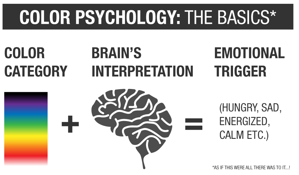
As the McDonald’s example above described, colors are commonly used by brands to elicit different emotions, thus leading to a reaction.
Millions of years of biological conditioning and further cultural associations have created these color-related emotional triggers common for us here in the U.S.
Red
Emotional Triggers:
Excitement, energy, passion, action, desire, danger, urgency
BIG-NAME BRANDS THAT USE IT:
Coca Cola, Youtube, KFC, Vans, Tesla
Orange
Emotional Triggers:
Optimism, uplifting, rejuvenating, friendliness, fun
BIG-NAME BRANDS THAT USE IT:
Home Depot, Nickelodeon, Harley Davidson, Delzer 🙂
Yellow
Emotional Triggers:
Happiness, enthusiasm, friendliness, optimism, confidence, warmth, caution
BIG-NAME BRANDS THAT USE IT:
Ikea, Ferrari, Walmart, Nikon
Green
Emotional Triggers:
Hope, growth, refreshing, balance, reassurance, success, relaxation, safety
BIG-NAME BRANDS THAT USE IT:
John Deere, BP, H&R Block, Starbucks
Blue
Emotional Triggers:
Trust, honesty, authority, serenity, intelligence, confidence, stability, integrity, professionalism
BIG-NAME BRANDS THAT USE IT:
Twitter, Best Buy, Ford, Paypal
Purple
Emotional Triggers:
Creativity, spirituality, individuality, quality, luxury, wisdom, vision
BIG-NAME BRANDS THAT USE IT:
Hallmark, Yahoo, Cadbury, FedEx
Pink
Emotional Triggers:
Romance, compassion, beauty, love, friendship, sensitivity, faithfulness, youth
BIG-NAME BRANDS THAT USE IT:
Victoria’s Secret, Barbie, Baskin Robbins
White
Emotional Triggers:
Freshness, hope, goodness, light, purity, cleanliness, simplicity, cleanliness, health
BIG-NAME BRANDS THAT USE IT:
Apple, North Face, Google
Grey
Emotional Triggers:
Stability, security, strength of character, authority, maturity, neutrality
BIG-NAME BRANDS THAT USE IT:
Nestle, Wikipedia, Mercedes-Benz
Black
Emotional Triggers:
Sophistication, power, mystery, formality, edgy, modern, luxurious
BIG-NAME BRANDS THAT USE IT:
Nike, Chanel, Jack Daniels, Adidas
Brown
Emotional Triggers:
Rugged, traditional, secure, down-to earth, comfort, wholesome
BIG-NAME BRANDS THAT USE IT:
UPS, M&Ms, A&W, Cotton
Color Combinations
A good rule of thumb for successful color schemes is to use three main colors: A base, an accent, and a neutral. The base color is your most used, along with an accent to complement that base. These two colors together can further impact emotional impressions. A neutral color is also key for broad-spectrum communication flexibility on both print and digital mediums.
Here are a few common color schemes:
Monochromatic
This scheme emphasizes the meaning of the base, core brand color. This is ideal for minimalistic and bold design and provides a stable, albeit sometimes visually tricky, emotional association.
Analogous
The colors next to each other on the color wheel offer harmonious, emotional connotations – such as yellow, orange and red.
Complementary
Colors opposite of one another on the color wheels – like orange and blue or yellow and purple – bring out the best of each other when paired. They’re dynamic and stimulating.
Triadic
This color combination draws in equal parts for three different sections of the color wheel. This scheme lands somewhere between analogous and complementary in its emotional response.
How to Use Color in Print Marketing
Play Match Maker
Match your colors with the feeling and intention behind what you’re trying to convey.
If you’re seeking out philanthropic support, for example, consider incorporating blues, brown, and shades of gray that appeal to intelligence, reliability, and stability. Blues can inspire sadness, while bright colors can motivate donors to take action.
Perhaps you’re trying to quickly target a more feminine audience – purples, pinks, and whites work well there. Another instance, like creating a sense of urgency, can be achieved by using pops of red.
Vary it up
Don’t be afraid of a little variety – while staying within the lines of your branding of course. Stay relevant and stand out with different design elements or style themes.
For example, seasons are a safe and relatable way to boost emotional responses for a wide audience. They trigger nostalgia, they create anticipation, and they can prompt a seasonal sense of urgency.
Be Selective
Your audience directly impacts the design of your print materials. You chose your color palette for a reason – make sure you’re not doing your brand a disservice by printing off-color.
Our G7 colorspace master certified press operations produce world-class print output, ensuring that your colors are produced exactly as intended. Pantone (PMS) colors are key for specific brand color formulas.
The type of paper you select for your print communications can also play a role in appearances of your hues because of how the ink interacts with the substrate. Your Delzer Rep can help you make the best decision for your printed branding materials.
Keep it Colorful
The effect of your branding colors depends on the style and design they are used in, combinations in which they are used, and the emotional triggers they produce.
Ultimately, color psychology in digital and print marketing play a big role alongside the full spectrum of efforts put forth by your team to further leverage your strategies and develop your business goals.
Kind of makes you rethink that black and white print job, doesn’t it…


